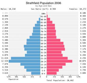
Population Pyramids are still required in Stage 5 Geography. I was surprised to see students hand-drawing them despite being equipped with notebook computers. Is the labour and extra opportunities for error involved in hand-drawing each bar really instructive?
Hand drawing is not mandatory, as far as I can discover. Advice published in 2003 assumed that charts would be hand-drawn.
“Population Pyramid activity: Students construct a population pyramid using up-to-date statistics. Teacher supplies worksheet with grid on which students plot their graph.” (BOS 2003)
But the “Evidence of learning” relates to comprehension and application, not to pencil technique.
“Students provide evidence of their understanding of Australia’s demographic characteristics through the completion of the pyramid and a comment on what the pyramid shows…. Teacher provides both oral and written feedback on student work samples. Comments inform students on how well they can draw a population pyramid and describe Australia’s demographic characteristics.”
The capabilities of new technology should be exploited here. For example, students can roll from 1971 to 2056, seeing the population profile shift as death rates and birth rates fall. (ABS 2008) The same can also be done for other countries. (De Wulf 2011) Population trends and other variables can be seen more vividly in new visualisation tools. (Rosling 2006)
Population as an outcome of understandable individual, familial and social decisions is a vital theme in Geography (Robbins 1983), and tools that reveal interactions of multiple factors are to be welcomed.
However, to return to the Pyramid: how would a model, efficient student produce a population pyramid?
Google unequivocally suggests Excel. Old instructions don’t work well, due to Microsoft’s shift from menus (in Excel 2003) to ribbon interface (in Excel 2007).There are some non-intuitive steps. Male population figures must be input as negative numbers, a custom number format must be applied to the horizontal axis, and the overlap and spacing of bars must be adjusted. Illustrated instructions (Javaid 2011) and video demonstrations (Lee 2008) are available. I can’t guess why Microsoft has not published a Population Pyramid chart type for Excel in 15 years.
OpenOffice can be used in the same way, if Microsoft is not in favour. (Gerard24)
Numbers (in Apple iWork) is similar, but the chart format is not quite as adaptable. For example, I couldn’t get the vertical axis to cross at zero. In both packages, male data must be input as negative numbers.
Recommendation
It is far simpler for students to type or import data into an application designed for the purpose. University of Leeds supplies an open-source Applet which a school can run on a server, so students need no software but a browser. (Evans 2011).
For individuals, the easiest tool by far is the (free) Population Pyramid Generator (Heaton 2011) for Mac OS 10.6+ – simple to use and quick to install. (Installation does require administrator permissions.) I have found nothing like it for Windows.
References
- Board of Studies of New South Wales (BOS) 2003, Geography Years 7-10 Advice on Programming and Assessment, p.28 [Accessed 26/04/2011]
- Australian Bureau of Statistics (ABS) 2008, Australia Age structure in 2009 Projected Resident Population, ABS, revised 27/10/2010 [Accessed 26/04/2011]
- De Wulf, M 2010, Population Pyramids of the World: 1950-2050. populationpyramid.net [Accessed 26/04/2011]
- Rosling, H 2006, Hans Rosling shows the best stats you’ve ever seen. Ted.com. June [Accessed 26/04/2011]
- Robbins, P 1998, Population and Pedagogy: The Geography Classroom after Malthus, Journal of Geography, 97:6, 241-252 [Accessed 26/04/2011]
- Javaid, U 2010, Comparative Histogram in Excel 2010. AddictiveTips.com, 19/03/2010 [Accessed 26/04/2011]
- Lee, C 2008, Create a Comparative Histogram in Excel 2007. Youtube.com, 23/02/2008 [Accessed 26/04/2011]
- Walkenbach J 2007, Creating a comparative Histogram. Excel 2007 Charts. Wiley.com [Accessed 26/04/2011]
- Gerard24 2011, Re: Population pyramid. Openoffice.org community forum. 28/03/2011 [Accessed 26/04/2011]
- Heaton, C 2011, Population Pyramid Generator version 1.1.2, Mac App Store, 16/04/2011 [Accessed 26/04/2011]
- Evans, A 2011, Demographic / population pyramid graph applet (v1.0), Centre for Computational Geography, University of Leeds. [Accessed 26/04/2011]


